From the outset Terrace Culture designs were at the forefront of Daft Laddie thinking. This can be seen from the first choice of No Barrier To Style, utilising a terracing crush barrier and various Claret & Amber trainers laid out on the terracing steps. The original photo which sparked this idea into life is shown here, a comment on the Facebook post suggested it would make a good T-shirt, which it duly did. If you’re interested in how I got to this stage go visit dosserdom.com where you will see the No Barrier design was the last one I made unbranded. I have been designing Motherwell related T-shirts since 1989 and this was the first design I chose after deciding to go for the brand name. Andy Lewis was the man responsible for bringing this idea to life so he goes down as the first Daft Laddie designer. The C&A actually produced for Daft Laddie was a 2nd version produced especially for the change-over as you will see from the photos.

There were 4 other colourways apart from the obvious Claret & Amber one. The decision to go for different colourways following requests almost killed the brand dead before it got started. After the initial investment to get the accessories organised came the first investment in stock. Some voices had called for different colourways, to avoid being seen as just a Motherwell brand. I took the plunge and ordered 50 of each in Blue, Green & Red, followed later by a Claret & Blue colourway to suit as many different teams as I could think of. And sold hardly any. It nearly ruined me and put me off acting on outside advice. I decided there and then to follow my own instincts and with the release of Ravenscraig, quickly followed by the original Dressers design I found myself back in the game. Luckily there were both hugely popular, no doubt they saved Daft Laddie so when I am accused of being Motherwell-centric as I have been, there is your reason for that approach. And long may it continue.
Ravenscraig artwork is a piece of pure genius by Martin Falloon. He produced it for the Dressers book and agreed to it being used on a T-shirt which brought the single biggest, and longest running, design on the Daft Laddie radar. I broke away from a group who were looking at T-shirt designs to back up the Dressers book success because they didn’t see the potential of this design. Best decision I ever made was to go it alone and trust in my own ideas. They still produced some belters but I was looking for something longer lasting, to make a going concern of it rather than a couple of short term options which was how it panned out.

Dressers original design was more of an afterthought than planned to be honest. I was looking for a follow up to the hugely popular Ravenscraig design and went for this simplistic take on the Dressers logo. It took off quite spectacularly if I’m honest, much to my own surprise and is still in demand to this day in its original form.
The photos show the vast array of colourways it became available in although most of them not to any great degree but it had potential.
The torn Dressers logo was another Martin Falloon creation, again it had to be printed using the DTG process due to the number of colours but it turned out rather well.

Trendy Not Rowdy was actually supposed to feature the Sunday Mail article featuring Crobie & Badger all those years ago, with the clipping used in the Dressers book. But it was proving problematic to have the image recreated so I eventually chose to use this drawing which came from an old Ellesse sticker page given free with products back in the day.
Keep Away From The Match came about by fortune rather than design. I was mucking about trying to figure out the graphics package I had and I accidentally produced this image in Motherwell colours. I had messed about with the rest of it previously to get the Keep Away slogan in the right place, but the colours were a pure accident.

Four Tops was my own creation, quite chuffed that my limited skills could produce this if I’m honest. The old Diadora advert fits nicely with the label from an old Motown single by the Four Tops, “I can’t help myself” mirroring my feelings at the trainers on offer when I first clocked it.
AMF design was also my own. Designers will notice the flaws no doubt but the average lad on the street like me will think it’s good enough. I kept that old TV image for years without knowing what to do with it. Eventually I had a lightbulb moment after seeing someone else doing an AMF design. At one time it seemed you just had to produce one to fit in.

Yesterdays Kids Today became the name I would use for this range because I needed to separate my terrace culture designs from overtly football or Motherwell related ones. I needed somewhere to showcase a specific range aimed at football lads of old. The idea behind it was to create images of us as kids taking part in activities we might have engaged in back then wearing the clobber we are likely to be wearing today or in later years at least.

Conkers was Zander Tollan’s last offering and what a belter he produced. Two young lads playing Conkers, I wanted the Stone Island badge, obviously using green and brown from the leaves gave us the option to bring in Stan Smith trainers, New Balance trainers as well and a CP Company jacket on one of the lads. The surrounding artwork was his own creation but sets it off nicely. Talented boy that. This was really the first design to come under the auspices of the Yesterdays Kids Today banner.
This reworked Dressers design was made in conjunction with Ricky in time for the Scottish Cup Final in 2018 and produced in navy & white featuring the same figure I used in the earlier Trendy Not Rowdy tee. This design marked the first involvement of Willie Kay as our graphic designer.
Bools was Willie Kay’s first creation from scratch, working on my garbled explanations by email, and he hit the nail on the head with the remit provided. A trio of young lads all clobbered up, playing the age old game of Marbles, just like we used to do in school playgrounds and beyond.
Another example is the Windrunner design. Originating from this photo of a young lad holding his jacket over his head and running into the wind. A pastime all of us will recognise going back to our Primary schooldays. I wanted to showcase Nike as one of the staples of our Casual youth, the Windrunner gave me the perfect example of how to marry up an innocent youthful pastime with the clobber we would grow into.

The Flicking Hard design is one I’ve long harboured an inclination to do, initially based on my Subbuteo fascination I wanted to do one using images from old Subbuteo catalogues and Willie Kay combined a few to come out with this design, obviously using my favourite colour combinations along with Adidas T-shirts and the old man with his Paul & Shark shirt with the double entendre tagline “You’re not flicking hard enough.” Any similarities between the guy in the design and myself is purely coincidental I am assured by Willie Kay.
Daft Lassies came about after I got a complaint that I didn’t cater for the female fans. This was true, I didn’t. Not many females got involved in football hooliganism which is where Daft Laddie ultimately originated from, in fact the name came from our ‘daft laddie nonsense’ as youngsters at the football. But that didn’t mean I wasn’t open to catering for the fairer sex so I got the thinking cap on to come up with a specific ‘Daft Lassies’ idea. And this was it. I brought it out in 3 colourways to broaden the choice. I think it worked fairly well.


Sid Dj has a page all of it’s own where I describe the process of honouring my pal Sid Wilson. This T-shirt never stops attracting interest understandably. Another Willie Kay classic.
Jumpers for Goalposts originated in my mind to fit with the narrative surrounding the Yesterdays Kids Today range. A wee game of World Cup was ever popular across the country, the quality of the labels on the jumpers just sets it apart from the innocent game of football being played out. The blue version came about following the Russian invasion of Ukraine. I don’t normally get involved in politics but there was a Hibs boy over there helping orphans who was trying to get them out and bring them here. I got in touch with him through a Hibs boy I know and offered to do these as a fundraiser for him. His progress was keenly watched and came to a successful outcome.


Scalextric CP – The Millie Miglia race is famous across the world, I just wonder how much more famous have the jackets worn by the drivers become. Again marrying up youthful pastimes with up-to-date sartorial matters.
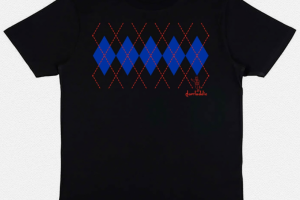
The Argyle range has turned into one of the most enduring Daft Laddie ideas ever. I first tuned into the possibility when I saw a guy walking past my car with a Brown hoody and Sky Blue tassles. I thought that was such a wonderful combination I came home and looked through my suggestions list so see what might work with those colours. I decided on the Argyle plan and never looked back. After the first lot sold out I was asked for different colourways, I duly obliged and it just grew arms and legs. I think I’ve produced maybe a dozen variations, not all shown here of course but basically any combination is possible so I started doing them on request.

Crazy Golf with a twist, a Daft Laddie twist of course. Typical early 80s casualwear with a humorous slant at a game we’ve all taken part in. Willie Kay’s Hitchcock moment too, he’s the one waving a golf putter around.
Old School was a later version of the No Barrier To Style theme. I had brought out 5 colourways in that design but I came across the idea of producing an all-Black version, inspired in part by an adidas advert from Shoot! Magazine showing 5 pairs of Black trainers. The Old School building was a kind of obvious backdrop.


Plastic Casuals is another of my double meaning efforts. Initially meant to represent Subbuteo casuals but can refer back to the days when Plastic Casuals were widely mocked, lads who played at being casuals or didn’t take it seriously enough were referred to as Plastics.
Guttied – Trainer enthusiasts everywhere will sympathise with this plight when the soles of your favourite vintage trainers start to split. I had it on the way up to a midweek game at Fir Park and had to phone my daughter to come up and bring me another pair.


Skin’ed – Another delve into my memory banks came up with this Skinhead design. Loosely based on the old Skinhead Cross design available in a shop called The Last Resort in London which was a favourite of the skins and punks of the late 70s, early 80s.
Against Modern Football has already been featured but there was a slight change to this one to fit in with the new printing processes being used. Produced in 3 colours as well.
Euros arrived in a flurry of activity, this design was timed to come out in conjunction with the football shirts in the Apparel section. A new Originals logo adorned it and was quickly adopted for use in other areas as you will no doubt see.

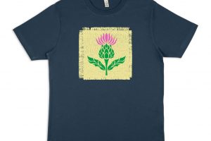
Thistle design was another afterthought. Looking at the badge on the football tops I thought it was good enough to stand on it’s own. And it did. In 3 colours again
Court in Session took me a while to bring out just waiting for the right moment of inspiration. I first thought of this when I was in court for something I didn’t do and I remembered my big mate offering to pay his fine there and then. He was on his way to Blackpool for September Weekend and was carrying his wages. Kinda like Sting in Quadrophenia. The attire shown wasn’t representative of the clobber we had on in court although we would have been wearing that around the time.


Autumn Outdoors – I had some feedback from a customer advising me to branch out into a kind of outdoors range. I did have intentions of going along that route at some point and that acted as the catalyst to me actually doing it. This is the Autumn one to kick things off. Unfortunately came in oversized fit, so I had to replace loads of them cos they were too big for my punters. Lesson learned to read the small print on the order page.
Evolution is basically the story of my life and the subcultures I’ve been involved in or flirted with. Punks (very briefly), Mods, Rude Boys, Skinheads and finally Casuals was basically how my teenage life evolved. And Willie provided me with my Hitchcock moment in this one.


Winter Outdoors – No such sizing dramas with this one, pretty much run of the mill but the Blue colour tee used really makes the design stand out.
Daft adi – I wanted a Roy of the Rovers style design and the use of adidas imagery is always a sure-fire winner. Produced in 7 sock colours to represent as many teams as I could think in an attempt to branch out further than my core Motherwell market. Didn’t work.

Spring Outdoors – Wasn’t long before it was time for a new season and another new t-shirt colourway adds to the allure.
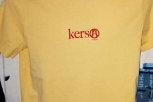
Kerso – Unfortunately my good friend Kerso passed away, meaning his collection of clothes, trainers, records and more had to be stored waiting for a decision on what would happen to it. I produced these 2 designs to help with the storage costs, taking on board the graffiti which went up of his name and his love of Soul Music with the Jean Carn record label.
Be Here Now was a blatant attempt to cash in on the Oasis frenzy. Not very successful I have to say which was a pity, good design I felt.
Summer Outdoors – The final season design, and one which prompted calls for a release of all 4 as a Collectors Pack. Sadly I don’t have the pull to have folk indulging in that sort of behaviour. Was a nice thought right enough.

Dressers – Now then, I felt the Dressers OG had just about run its course and needed a bit of a freshen up. After some deliberating I finally got agreement to use this version and duly proceeded to roll it out in 8 colourways.
Trendy Not Rowdy – Once again I go backwards to go forwards. An update on the early TNR version, made available in 15 colourways no less. I loved this graphic Willie Kay made up when we were sitting at 11. Basically can be made available in any colourway you can imagine. Such is the way of the modern world, there is no limit, anything can be made to order

Kerbie – The return of Yesterdays Kids Today, a couple of label clad youngsters engaging in one of the most popular pastimes of my childhood out with football.


