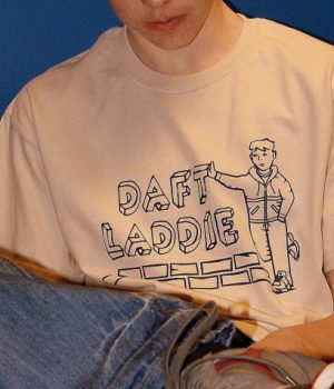
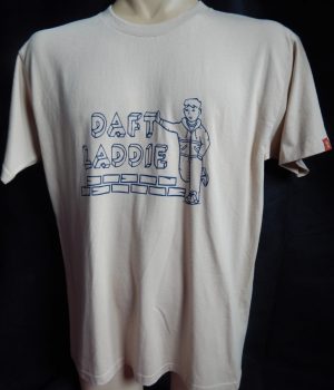
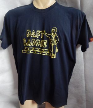
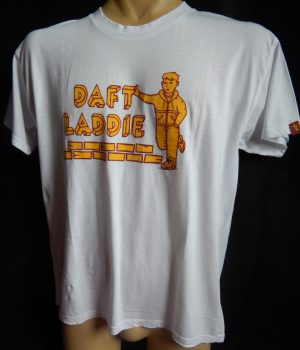
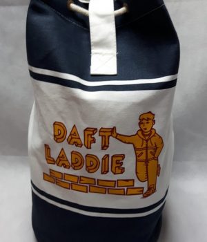
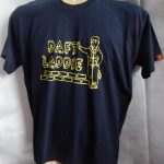
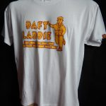
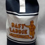
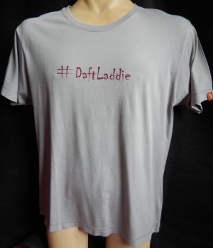
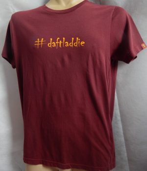
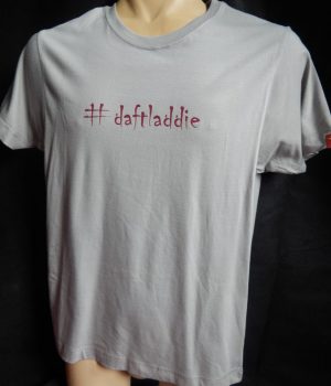
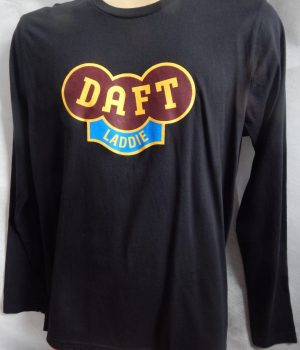
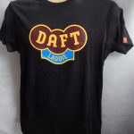
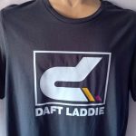
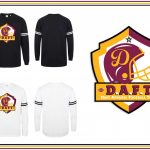
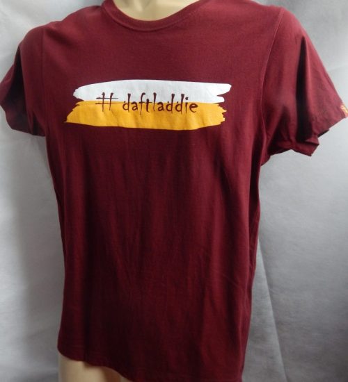
Branded Tees are obviously something which serve a dual purpose, advertising the brand at the same time as being the latest addition to the brand design portfolio. It’s important for it to be a good design in its own right though, not just an easy way to add to the range. I always felt Daft Laddie wasn’t the kind of brand that needed to big itself up, instead I preferred to let the artwork do the talking. But I was persuaded differently not long after I started and the logo design was the result. Firstly in Navy on a beige tee, later Yellow on Navy. I went for Claret & Amber on a white tee with the dual purpose of having these duffel bags produced. Not enough demand for the bags to warrant a run on their own so I combined the print run with the tees in order to make it cost effective.
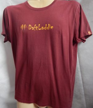
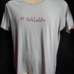
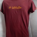
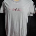
This hashtag logo would seem simple enough but the glut of photies proves the old adage of never taking things for granted. I found a font called Chiller which I immediately liked for this purpose, copy & paste in an email to my printer though was not the best practice. I took it for granted the font would turn out the way I sent it but as it turns out the text was corrupted in the email and I didn’t find out until the first lot were printed. The second lot were closer but still not right, third lot still not 100% until eventually I asked to see what I had sent and we found out what the problem was. Finally at the 4th attempt we got what I was after.
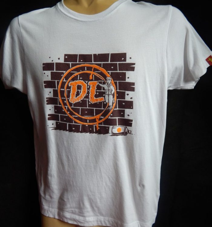
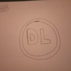
The Brick Wall idea came from a chance comment from my daughter Amber. I was struggling to decide on the best way to restart after our winter break, which is always the case year after year. Basically I find it’s difficult to engage with customers again following a break so want to announce our return with something of a bang. Amber suggested something simple but striking, drew a circle with DL inside it, suggested a wall behind it with the letters painted on in grafitti style and this is the result.
Brush Strokes design was initially intended for use on the Motherwell Amateurs jersey but the potential to use the design as an addition to the range was always apparent.
Dukla GK was again aimed at the Apparel side for use with the Dukla jersey with the added bonus of being a stand out design on its own merit again. This was produced in short sleeved, long sleeved and Sweatshirt format to test the waters further on items outwith standard T-shirts. Have to say with limited success but it opened a few minds as to the possibilities I believe.
I tasked Willie with modernising the logo with a view to introducing simple embroidered garments as opposed to the graphics used in previous designs. This logo ticked all the boxes for me, simple but effective. The first photoshoot was electric, real sense the brand was moving on up but keeping the family feel to it. Introducing jackets and hats on a larger scale along with cargos too brought a sense of something’s happening here.
After the success of the new logo and launch of the new products, the following season it was important to continue the upward spiral and with the Blackout range that certainly was the case. Based on the current penchant for all Black clothing at football games, I think I covered all bases with this one bringing in cagoules, gloves and travel bags.
Trying to keep it fresh the next collection featured the logo in Camouflage, coming with a military feel printed on Navy Blue, Army Green and Airforce Grey products. This met with a fantastic reaction from a whole new subset of customers.
Going back to a Claret & Amber logo was a challenge, it had to be something different and the logo Willie designed for the Euros range fitted perfectly. Changing the colours in that and going with small front print and large back print was in keeping with the current trends.
Monochrome logo – Of course the Originals logo can be as versatile as the standard DL logo and the simple Black on White imagery gave it that German feel around the time of the Euros tournament over there.
A new logo adorned the Active range almost by mistake. I found a cagoule in one of my regular supplier searches which was very similar in style to the Patrick cagoule of the 80s. Willie produced this take on the badge and we were set. The Cagoule was the first, then I hit on the idea of a range of athletic wear, found some baselayers, short and long sleeved and rolled it out in tees and sweats, hoodies too.
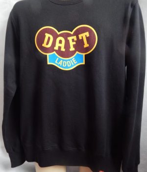
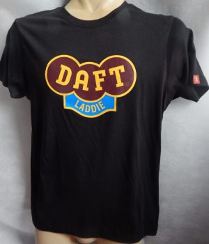
I wanted an American theme to tie in with the Superbowl and these were the results. I wanted to shorten the name as well so Daft seemed appropriate. I like a bit of self-deprecating humour, not sure that’s shared by that many of my clientele but these were all fairly successful. The Collegiate one featuring the football helmet especially popular with it’s long sleeves.
Credit to the good lady for this one, she did a quick sketch with an idea for a Loveheart logo to use in a Ladie range. This spread to Hoodies, Sweatshirts, Polos and T-shirts and created something of a storm of interest at the time.
I’ve always had a longing for a scooter. When I was 16 my mum refused point blank to let me get one cos I was deaf in one ear. She said I wouldn’t hear traffic. I never did get one but they always held my fascination. I know a lot of guys in the scooter clubs around this area so I wanted to do a design to show that passion. This was a labour of love but I had to do the research to get right, no way did I want fingers being pointed at me when they were released. So I asked about for ideas and came up with the Lambretta DL200 and the Ink Spot logo was a brilliant story. Apparently the designer was using a fountain pen and some ink spilled on his page. He liked the way it spread out across the page so much he incorporated it into the design of the scooter hence the inkspot backdrop. The logo on it’s own came in a vast array of colurways.
Ska Sid is a design which happened much like the 2-Tone movement. Appeared in a flash of inspiration, made a significant impact in a short period of time then faded away but keeps popping up in the consciousness. I was having a drink in my daughters house one night when the idea struck me to celebrate the finest youth movement of its era. I messaged Willie, told him my thoughts, half an hour later he sent this design back. No changes necessary, just got it in one. Still gets requested for a reprint.
The Teddies just adds to the family feel. These were produced one Christmas and have remained a firm favourite.
