This section covers Motherwell related designs, of which there were many before the days of Daft Laddie but for now I will concentrate on the branded products. This wasn’t planned, it just sort of evolved as obviously with my background Motherwell fans make up the majority of customers, so it followed that I would cater for them on occasion as well as aiming to please a wider audience with other designs.
The No Barrier To Style design muddied the waters in terms of categorising, for me it was firstly a Terrace Culture design but it is obviously a big winner for Motherwell fans. For now though we’ll leave that in the Culture category with an honourable mention here and concentrate on the obvious.


Subby – This one comes from the box design of Subbuteo teams as you can see here, the figure in the centre of the box has been replicated and features an early 1970s Motherwell kit, a la Joe Wark. Credit to Zander Tollan for that artwork.
Turnstiles – I produced this using DTG printing due to the number of colours required, the old classic entrance to the terracing makes for an iconic image.
McB – This idea was taking shape when I received devastating news that my old pal Paul McBurnie had passed away. We went way back, going to gigs as well as football trips. He was well known in the mod & scooter scene as well so that accelerated the idea behind this design. We shared an interest in mod/ska culture and football so the original plan to perhaps use Mod Culture Ball as a title were decided on and the initials MCB changed to McB to honour his name. Badges were also produced to accompany this design and a donation sent to the diabetes charity JDRF in Pauls memory. Later my mate Zico took a photo wearing the T-shirt in London and challenged others to send pics in with their far travelled McB shirt. Folk sent pics in from USA, & America as well as closer to home.
Keeping On – The well known Northern Soul fist design has always been lurking in the background as a potential choice for a Daft Laddie rework. Willie Kay came up trumps with this take on it as he always does with his design work.

Weird & Wonderful – Figure taken from the cover of official Motherwell Handbooks between 1935 and 1965 to use as a promotional item on the launch of the Weird & Wonderful Motherwell Collectables book.
Colours True – Selection of Subbuteo figures in iconic Motherwell kits. I do like my Subbuteo imagery

Super Striker – Another image from my youth, Super Striker was the challenger to Subbuteo for the title of the most popular football game. I used the box design as my inspiration for this one.
Handbook – I removed the book reference and used this vintage figure as a stand-alone design. Looks a bit like Lennon Miller I reckon.

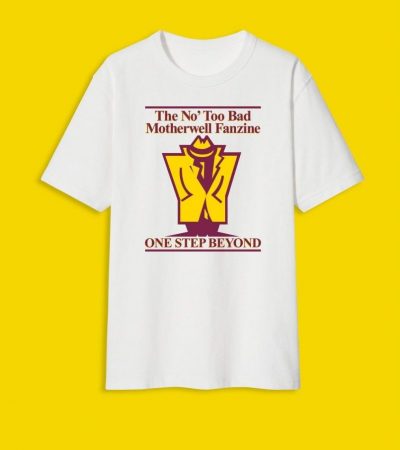
One Step Beyond – I produced a tribute fanzine issue to commemorate the passing of 10 years since it ended back in 2014. These tees were produced way back so I thought I would reproduce them as well.
In With The Bricks- I have a few Motherwell bricks in my garden, for display purposes really. This design was inspired by them.

Postage Stamp 95 – The official programme from 1995 was the inspiration for this one, showing all 3 Motherwell kits of that era.
Bugs Life – John ‘Bug’ Young was heralded as the youngest player ever to play for Motherwell until Lennon Miller took the honour. He was part of the team around the transition from the merger of Alpha & Glencairn which then emerged as Motherwell FC. He is seen here lying on the ground age 16

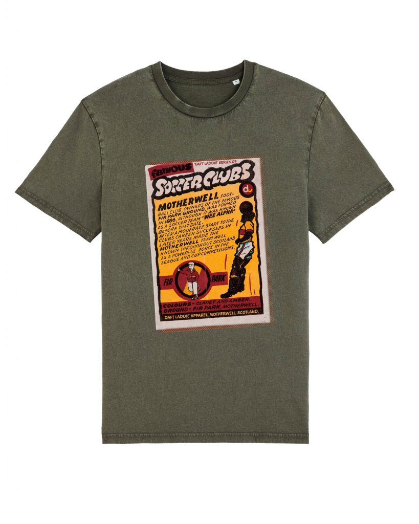
Bubblegum – I took the image of a 1970s bubblegum card I found and asked Willie Kay to rework it to produce this design. The khaki background really makes the colours jump out I rekcon.
Postage Stamp 80s – Another old programme inspired this design, the original idea was just to use the player and the cirle but it turned out better this way I think.

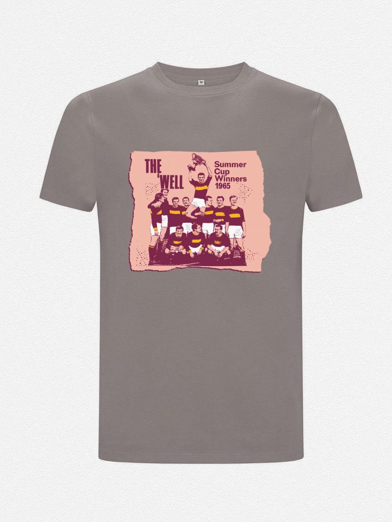
Summer Cup – We have to celebrate our history where possible and I felt this Summer Cup victory in 1965 is often overlooked. This was a major honour at the time and deserves to be noted in the modern consciousness.
1 for 2 – The title makes reference to the old saying about magpies ‘One for sorrow, two for joy’


Cup Ties – Launched specially for the League Cup Semi-Final in November 2025, this design encapsulates the shift in Fan styles across the eras where Motherwell have been successful or close to it in Cup competitions. The 1930s is famous for our one and only League Title but we also made it to 3 Cup Finals albeit unsuccessful in all of them. The 1950s was our golden Cup era, winning the League Cup in 1950 and Scottish Cup in 1952. The 70s saw the beginning of my personal love affair with the team Willie McLean built which took us to consecutive Semis in the middle of the decade. 1991 will forever live in the memory for obvious reasons with Tommy McLean going one better than his brothers in bringing the Cup back to the old Steel town. And then there’s now!
Of course ‘dosserdom’ exists as a separate entity with a nod to life before Daft Laddie. Follow the link below to view the website.


